JuxtaPosition
The definition of juxtaposition is placing two contrasting elements together in order show a difference in perspective or to imply a statement from the artist.
The two elements should be contrasting, or opposing, each other in subject matter, shape, color, line, or meaning.
Juxtaposition is a very powerful tool. It is used to show difference in time, scene or concept.

Reflection & Symmetry
A symmetrical image is one that looks the same on one side as it does on the other.
Look for symmetrical patterns with strong lines, curves and patterns. The more visually beautiful your subject is the more appealing it will be as a symmetrical image.
Reflections in photography can lead to some amazing effects and beautiful images. Using water, windows, mirrors or any sort of reflective surface can change an image into a work of art.

Frame in Frame
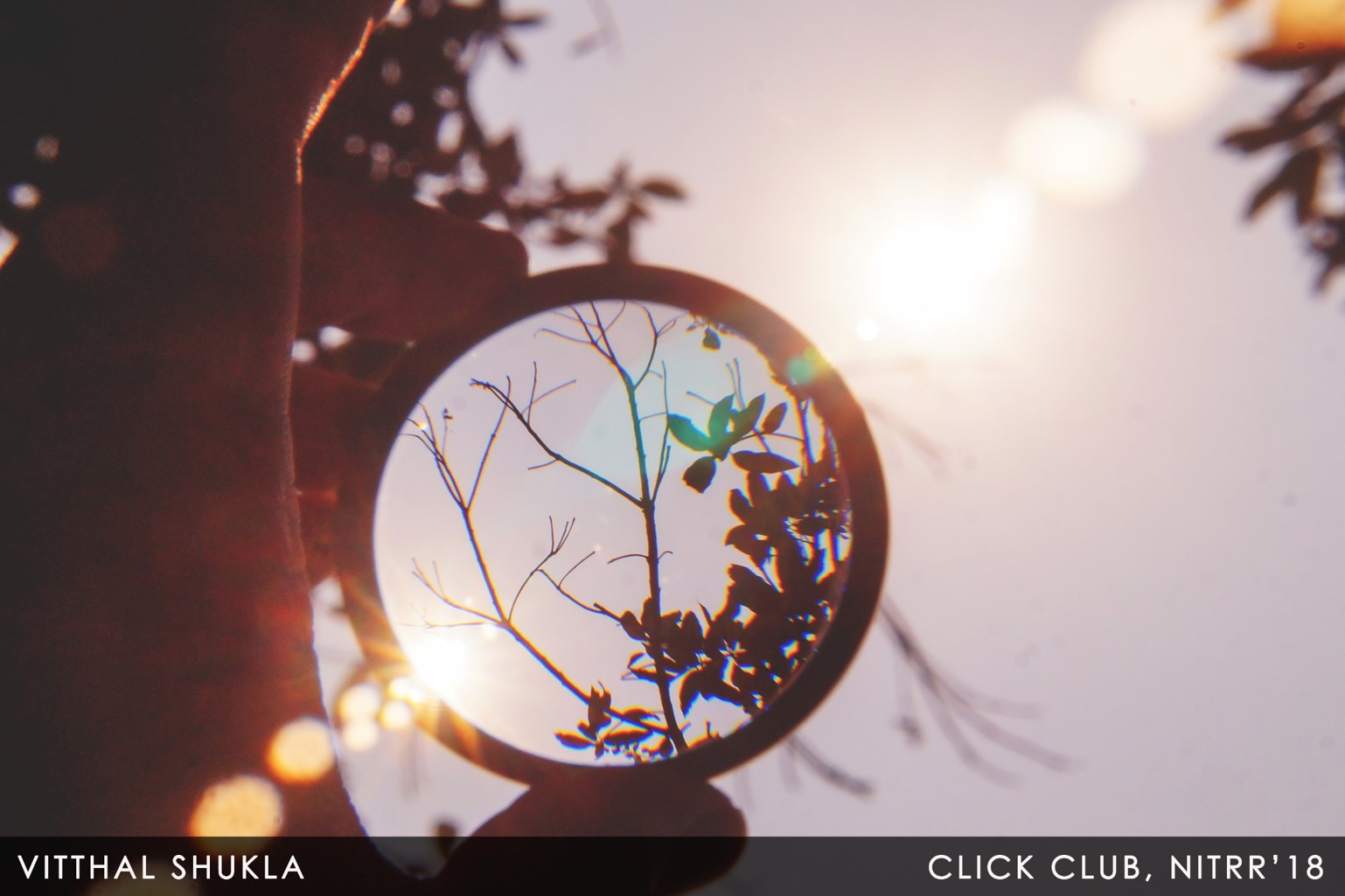
In photography, a frame within a frame is when the photographer uses something within the scene in front of them to frame the main subject. Therefore a second frame is created within the image hence: a frame within a frame.
This compositional technique can improve your image in several ways: Firstly it draws attention to the subject helping to isolate it from any distraction and clutter within the image.
Secondly it can add depth and layers to an otherwise flat and boring image.
Finally a frame within a frame can create mystery and intrigue within a photo resulting in the viewer exploring the picture for longer.

Leaving Space
This rule incorporates two very similar ideas: breathing room and implied movement.
The leaving space rule probably comes naturally to you, but if you need a way to visualize it think of your frame as a box and your subject as something you're going to be putting inside of a box.
To make your subject comfortable, you need to give him a bigger box that allows him some visual freedom and/or freedom of movement.
If your subject is looking at something, make sure there is some “white space” for him to look into. Likewise, “implied motion” means that if your subject is in motion you need to give her some space that she can move into.

Rule Of Thirds
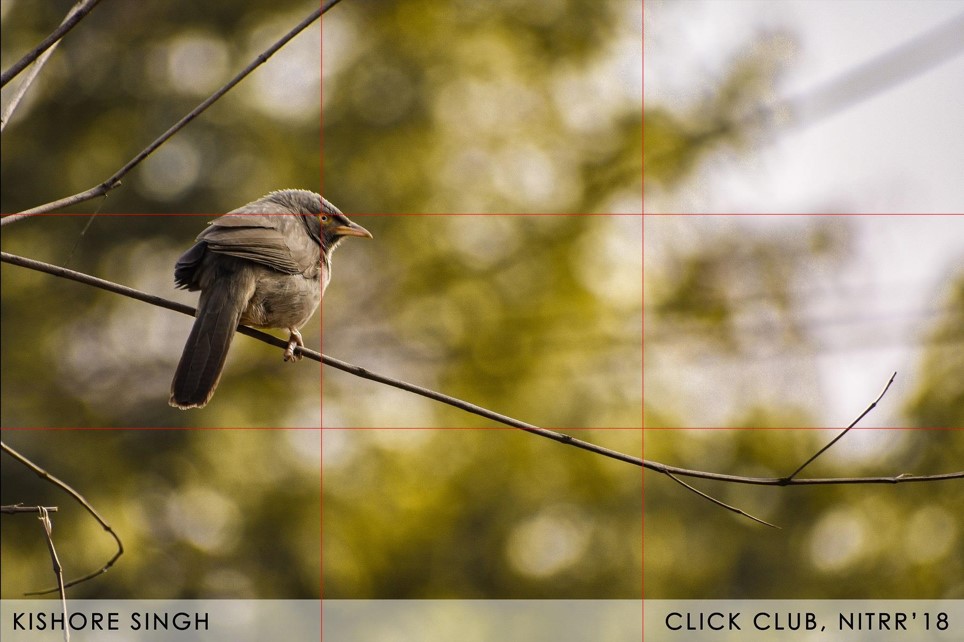
The human eye tends to be more interested in images that are divided into thirds, with the subject falling at or along one of those divisions.
Many DSLRs will actually give you a visual grid in your viewfinder that you can use to practice this rule. Divide your image with four lines into nine equal-sized parts, then place your subject at the intersection of those lines.
For example, when photographing a person it is generally better to position him or her at the right or left third of the frame rather than directly in the middle.
